Shop SMS SMS Technical SMS products & services SMS in articles and webinars Testimonies
SMS and the environment SMS news Interesting links SMS: How, why and when SMS Q&A
SMS for design and
advertising Getting started with SMS colours SMS BLOCKS Cost of ownership |
SMS for print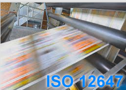 Printers (in all categories) SMS READY - or not? |
Questions and Answers (Q & A)
Q: "As a Brand Owner, do I have to subscribe to SMS and pay EUR 600 pr. year to Spot-Nordic and order all colour variations from Spot-Nordic?".
A: Subscription to Spot-Nordic is for sure the recommended way to go for companies and brands that want a firm grip on their brand colours for all media, since the subscription includes the colour services and technical assistance by Spot-Nordic, including communications with both designers, Printers and Manufacturers of SMS colours.
However, Brand Owners can for
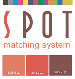
starters buy a copy of the SMS colour palette they want to use in P20
format (either the P20, P20e or P20x palette) and renew it every 12
months to have access to SMS services for non-subscribers and a license
to use SMS colours for their official brand identity.
Brand Owners that choose to use colours from the Standard palette can
even get by by simply ordering the P31 colour palette, which contains
all the SMS Standard colours in Excel format for use in Office apps
(Excel, Word, Powerpoint...) and renew that every 12 months, for a
license to use the SMS Standard colours for the visual brand identity of
the company.
The cost of a P20 or P31 colour palette is EUR 60 (pr. year for SMS users that want to use SMS colours for their official brand/logo).
Q: "At first the Spot Matching
System seemed exciting as it looked like a well defined matching system.
Then as I read it fell apart. This system is based on sRGB.
I fear that this will limit the usefulness in the long run. I'm more
interested in a system that matches colour in a wider range for display
and inkjet printing".
A: The Spot Matching System
is not based on sRGB. It is a collection of named standard colours
that have in common that they can be reproduced/printed in CMYK to
international standards on
coated and uncoated paper for an identical side-by-side comparison.
This is completely unique and competitive colour matching systems have it
in common that their colours shift/change, depending on the substrate
they are printed on.
The fact that SMS colours also fit within the sRGB colourspace is an amazing byproduct.
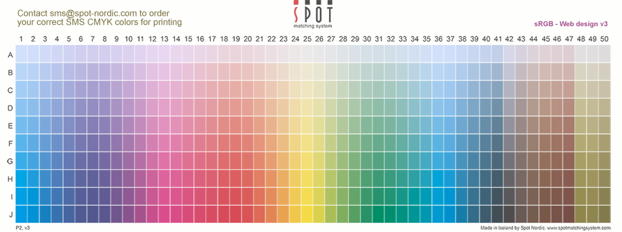
It for instance enables us to display the actual SMS colours online. The sRGB image here above contains the first 500 Standard colours of the Spot Matching System in their final version - what you see is what you get, - as long as you are reading this on a standard sRGB display.
In your work as a designer, in some cases you may need more vibrant colours - a wider colourspace and then we recommend you use the SMS MAX colour palette, the Pantone colour matching system or possibly HKS, RAL, Avery or NCS, depending on what you are planning.
In many cases however, our colours are surely
vibrant enough.
This byproduct, i.e. that SMS colours can be displayed correctly on
standard laptop displays, tablet displays and smartphone displays, that
all have in common that they use the sRGB colourspace is in fact another
important reason, why the Spot Matching System is just the right colour
matching system to be used to define brand colours.
Not only are SMS colours the same when printed on coated and uncoated
paper in standard CMYK. They also remain the same when used in
so-called omni channel campaigns, - which are in fact
quite common these days, - where the same advertisement is set to run in
print, on TV and on social media sites.
For standard graphic design (web design,
print design) - and of course brand design, selecting from a range of
named colours that are available for standard CMYK printing on coated and
uncoated paper, web and TV, seems like a superior choice when compared to selecting
from a range of named colours that are only suitable for one purpose/one
media.
Colours from wider colourspaces, such as colours from the outer edges of
the Adobe RGB colourspace, cannot be
displayed correctly online on standard displays and they cannot be
printed correctly in CMYK, which renders them useless for professional
use where colour consistency is required.
For professional brand design and multi channel advertising campaigns, uniform reproduction of the chosen colours to international standards such as sRGB for displays and ISO 12647 for CMYK printing is an absolute key element.
Q: "What about metamerie - how do I manage SMS colours in different lighting?".
A: The default lighting for SMS colours is daylight - D50, with a similar amount of UV as we find in regular daylight.
The idea here is that if you take your printed job
outside and view it, you should see the SMS colours as they should look
- as they are. This is why we use the measurement condition M1 for
spectral measurements of our SMS colours. This approach is based on the
current ISO 12647-2-2013 standard, which was originally created to adapt
the visual outcome of printed colours in CMYK offset printing to take
into account the visual effect of UV in normal daylight
affecting optical brighteners in typical production paper - which
radiate blue light when the UV light, that is a part of normal daylight,
hits them making the substrate and all the printed colours appear
slightly bluish / cold when viewed in normal daylight.
The technical reaction to this is to basically "warm" the printed
colours a bit digitally before outputting the job for print - for the
visual outcome to be just right - not too cold and not too warm - when
viewed in normal daylight.
Having said this it is possible to
manipulate SMS colours to look just right when viewed under other
lighting conditions than D50 - by in fact replacing them with custom SMS
colours made to look a certain way in a certain light - say if you are
printing advertising billboards that will be set up in stores or at an
exhibition, where the lighting is not daylight. In this case you can
measure the lighting exactly where the advertising board is to be set up
and we can cook your SMS colour to look just right, just there.
The more logical approach is of course to insist that lighting in public
areas, stores and at exhibitions be normalized to D50 daylight, - since
normally sooner or later you will be
evaluating the product in daylight, so picking it out in
non-standardized light is never, ever a good idea. However that may be
difficult to enforce in our chaotic world.
Q:
Can i use an SMS colour with a
Generic CMYK profile everywhere in the world?
I'm in Europe but need to print in Japan or US. The printers over there
use different icc profiles but they need to have the same final colour
results.
A: The short answer is no. You cannot use one generic CMYK profile everywhere in the world and expect the same results.
This question is however very logical and understandable and of course designers have by now gotten used to working in Adobe RGB and then just having each printer convert to their colourspace to "maximize the colour space" - i.e. to make your RGB images "pop" as much as possible, depending only on the substrate and colour gamut of the printing press.
SMS colours are however not intended to
"pop". They are absolute colours that are supposed to remain the same,
wherever you see them and for any print process. This is why they need
to be handmade and delivered in CMYK format for each combination of colour standard, substrate and
printing press/device.
Before you start using SMS colours in print design, the first thing you
should do is to check in advance to which standards your printers print
- if it's Fogra standards, G7 standards, Japan standards - or perhaps no
standards at all.
You should have all your printers subscribe to SMS - become "SMS READY", as you will be once you subscribe yourself.
In that case Spot-Nordic issues SMS READY badges to the printer to the print standards that the printer is actually able to print to. Many printers claim to print to various international standards and they may even be formally certified according to G7 or PSO. That however does not mean that they can print SMS colours to our tolerances, which are considerably more narrow than those of ISO standards, which may be fine for printing of photographs but not nearly narrow enough when it comes to consistent printing of SMS spot colours in CMYK that may be made up of up to 4 process colours.
For that, the printer has to be in full
control of his process - each printing press or printing device used for
print production has to be perfectly tweaked and checked every day by
it's operator.
Spot-Nordic offers printers to build custom profiles that adjust their
actual printing to the offset standards
of their choice, Fogra, G7 or even Japan standards - whether they are
offset printers, gravure, flexo or digital printers.
SMS colours can be adapted to those standards.
The default SMS print output is adjusted to
Fogra standards. It's not because we love Fogra more than Idealliance or
anyone else. It's simply because Spot-Nordic is a European company and
Fogra is a European institution.
We can however, if requested, also build SMS print profiles adjusted to
G7/GraCol icc profiles or Japan colour or even all 3.
Built into the SMS policy is that we feel designers should be allowed to
use the CMYK icc profiles they are used
to using and printers should adapt to those, whether they are in Europe,
USA or Asia - not vice versa.
However, we don't live in a perfect world so even designers and brand
owners sometimes need to adapt to their printers.
Brand owners subscribed to SMS or their authorized designers, can order variations of SMS colours on a job-to-job basis suited for printers that print to Fogra, Ugra, G7 or Japan standards, free of charge.
You just need to know which CMYK icc profiles you should use for each printer you work with - which is directly linked to the actual white point of the paper/substrate you intend to print on and the print standard of each printer for each type of paper/substrate.
If the printer is SMS READY, we can tell you exactly what profile to use for each print job at the same time we provide you just the correct version of your SMS colours or just the correct version of your logo.
If your printer is not SMS READY and you still want to have them print for you, we need to know which CMYK icc profile the printer has instructed you to use for the job and we will provide you with SMS colours adjusted to this icc profile, in CMYK format. If the white point of the actual production paper/substrate is not in accordance with the white point of the icc profile your printer instructed you to use, the SMS colours will not be correct, - since they are always adjusted to the white point of the CMYK icc profile (used to softproof the job before sending it into production). To put it another way; icc CMYK profiles are made by measuring colours printed with inks of a certain type by a certain print method on a certain substrate of a certain type, with a certain white point.
A lot of printers and designers don't worry
too much about such petty things as papertype or white points or even
international print standards.
In order to print SMS colours correctly however, you have to, - and your
printers have to.
Q: Display of
smartphone, TV, laptops etc. are mostly uncablibrated and sometimes
tough to calibrate.
How is it possible to match colours across devices.
A: It is true that most displays in the world are not regularly calibrated. SMS sRGB colours are only correct on calibrated sRGB displays - or Rec. 709 displays, such as Television sets, Cinema screens or digital projectors.
If the display is old or has been adjusted
with custom settings for a more "pleasant" experience, the colours will
change. The same is true for instance when movies are being colour
corrected.
The colours are adjusted to a standard calibrated display but then
people will watch the movies on their own TV's or online on monitors
that they themselves have adjusted and usually not calibrated. We
could also talk about white paper that fades to yellow in time - and
it's colours along with it, - ink pigments that fade etc.
The only thing brand owners that use SMS colours can do is to calibrate
THEIR displays and hope that most of their customers do the same with
their displays. Of course digital displays used for public advertising
should always be properly calibrated - and in this case brand owners can
insist on this before buying a spot or renting a screen for instance.
If we think about smartphone displays, fortunately a lot of people replace their smartphones quite regularly - even once pr. year, so the display hardly has time to trend too much in that time.
If we additionally add the fact that SMS
colours are exactly tweaked to look identical on screen and in print,
even the visual difference between a well calibrated sRGB display and an
uncalibrated sRGB display is typically much smaller than the difference
between a printed version of a colour from any other colour palette than
SMS and it's digital on-screen counterpart on a perfectly calibrated
screen.
So even when viewed on an un-calibrated display, all is not lost and the
SMS colours will in most cases at least be in the ballpark of being
considered "visually acceptable" to most mortals, although they might
fail miserably if we were to measure them and compare them to the SMS
master colours.
But to be clear we always recommend calibration of digital displays every 1 or 2 weeks or so - especially if you evaluate colours on that display.
Display calibrators (software and hardware) are available even for smartphone displays - such as this one from our friends at X-Rite: https://www.xrite.com/categories/calibration-profiling/colourtrue
Here you only need to download the app (free of charge) and then you need a colourimeter that you can attach to your mobile smartphone or tablet to do the calibration or even create a new display profile.
Q: "Looking at the standard SMS palette, it looks like a lot of light and dark colours are missing".
A: The current SMS colour palette includes so-called primary and secondary and even some tertiary colours, if we evaluate it from the point of view of CMYK printing.
It is true that
there is room to add more colours and we fully intend to add new
standard SMS colours to the system, a few at the time. Last year
alone 80 new standard colours were added - our "Brown range" and then
our "Olive range".
In the meantime, subscribed designers or brand owners who need shades
that are either lighter than our lightest colours or darker than our
darkest colours - or somewhere between our standard colours can simply
contact sms@spot-nordic.com and
we will be happy to cook up custom SMS colours, either based on a
description by the designer or even based on an sRGB colour provided by
the designer. We can in the latter case simply put that sRGB under our
special SMS microscope and find the closest SMS match to that colour.
We can in fact do this to any colour, - just as long as there exists a
web version of the colour that is considered visually acceptable -
whether it is an old logo or a brand new creation.
It is still important to keep in mind that SMS colours are NATURAL
shades, which means that there is a limit to how dark they can be to
fulfil our criteria of being commercially reproducable in CMYK on both
coated and uncoated paper and to fit into the sRGB colourspace, all at
the same time. That is our strength and our speciality but also our
weakness if super dark or super vibrant colours are required for a
certain project.
Q: "Is it ok to mix up SMS colours from the standard SMS palette, the SMS ECO palette and the SMS MAX palette".
A: No. to avoid mistakes,
we recommend one SMS standard pr. subscription.
When you select
colours for a certain brand or a certain advertising campaign for
instance, you must pick your SMS palette first and stick to it. If you
want to work with SMS colours from different SMS colour palettes, we
propose a separate SMS subscription for each palette, one SMS palette
pr. brand and customers can of course switch completely between SMS
palettes when they renew their subscription at no extra cost.
Q: "I am an offset printer with a couple of digital presses running as well. Do I have to change my inks for the offset presses or the cartridges for the digital presses if I want to print SMS colours?"
A: Absolutely not. You continue to use the inks you have been using to print CMYK jobs. To print SMS colours you simply need to adjust your print process for printing to standards - ISO standards, either Fogra or G7. If you are already set up to print to standards, you just need to inform your customers or even apply to become SMS READY certified by Spot-Nordic.
If you do not currently print to ISO standards, Spot-Nordic can build custom output icc profiles that will enable you to receive PDF files with embedded standard icc profiles and to print them perfectly according to the requested print standard (for instance if the icc profile is PSO Coated v3, you need to print that one according to Fogra 51..). We can do this both for your offset presses and your digital presses, so you can get the same visual result from all your presses. All you need to bring to the table is control of your process.
